1.GDC
The typography on www.gdc.net does some heavy lifting. There is a lot of content on the site and they do a great job setting up the hierarchy to do the work of grouping all this information together. It is easy to differentiate the levels of information from the title to sub-titles.
Note the header, including the search bar, has a consistent treatment of the font matching the rest of the site.

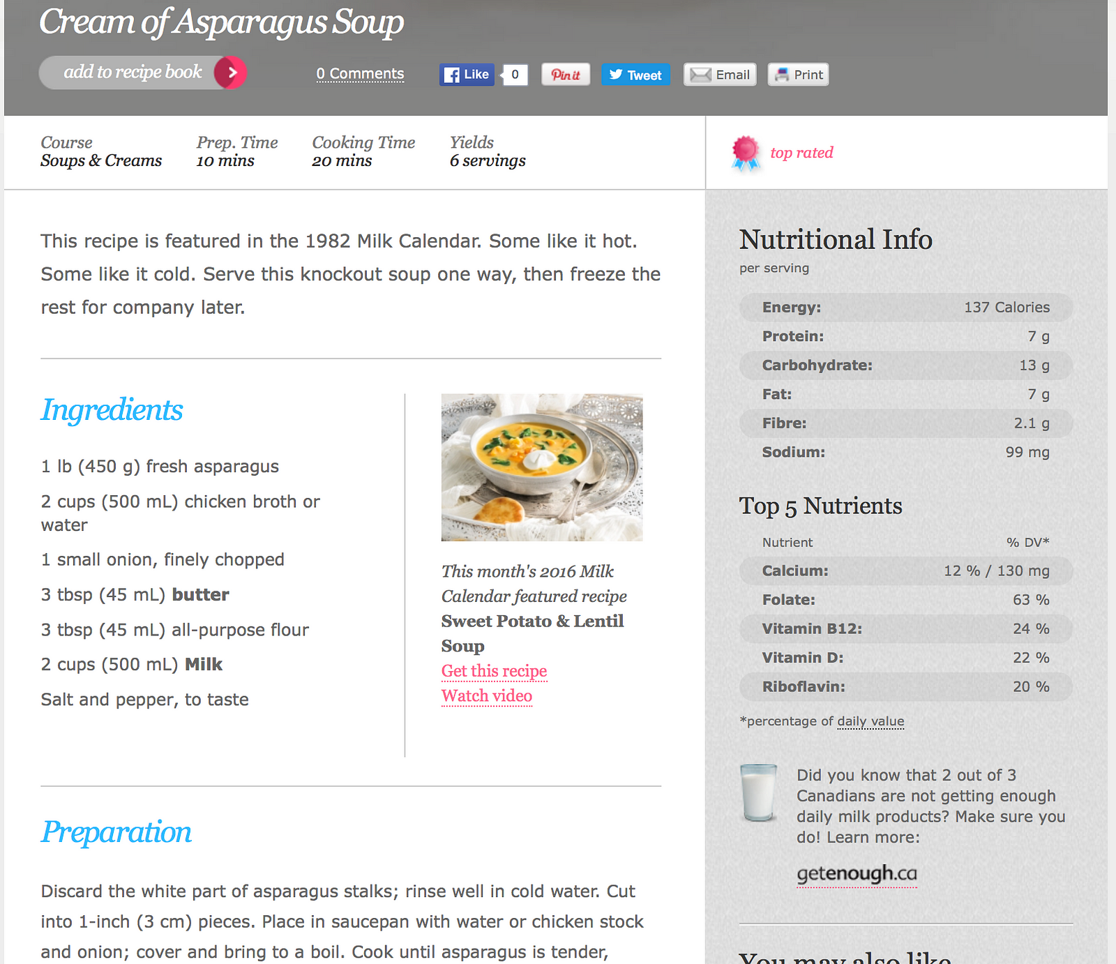
2. Dairy Goodness
The typography on this recipe website www.dairygoodness.ca is appealing because they make use of white space and gear it towards the task of the user. Having a clear sense of which line you are reading is important when following recipes. They also add some flair to the main headings by using a slightly humanist font with some colour, but keep the instructions simple and clean. They use bolding to highlight the main items in the nutritional info which could help you quickly scan the information.
Note the blue headings in different fonts guide the reader to the next steps in the recipe, these blue headers are only used in reference to recipe related tasks.
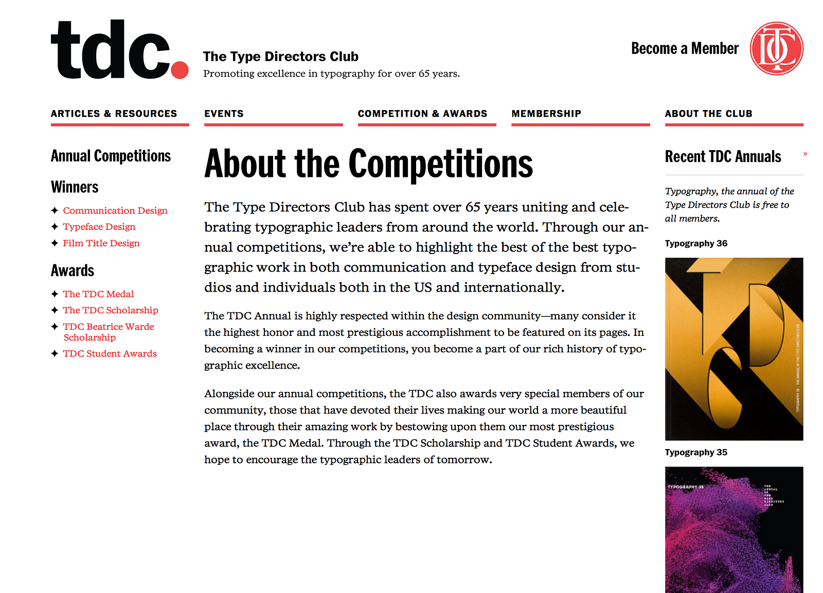
3. TDC
Of course, we would expect https://www.tdc.org/about-the-competitions/ to have good structure. The hierarchy is clear, the whitespace is ample, and they use weight, size, and colour to identify different content groups. You might notice that the GCD website uses the red and black colour scheme as well.
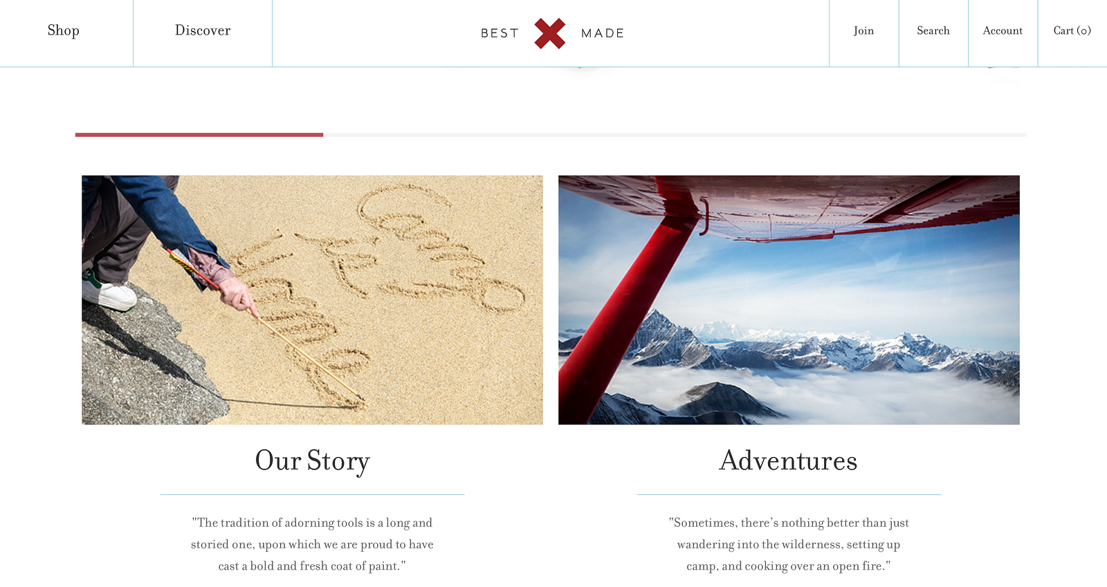
4. Best Man Made
This site: https://www.bestmadeco.com uses large areas of white space to frame the text. Big contrast between the heading size and body text, makes it easy scan the headings to see what each paragraph is about. It is also refreshing to see a site using a serif font. The line separating the heading and body content also provides another visual clue. If you visit this site be sure to watch the page counter on the top images.
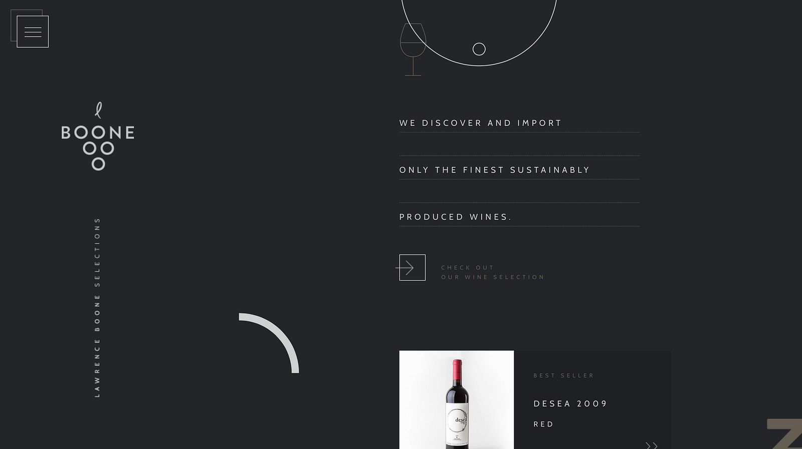
5. Boone Selections
This site: http://booneselections.com uses white space to keep the text the main focus. Big space between the lines, and extra spacing in the horizontal line gives it ample room to breath. Colour and size are being used to identify different headings.
6. This Also
Big text, and big use of white space. This site http://thisalso.com/projects/chromecast-big-web-quiz has a simple clean approach to its typography. The leading is generous and the paragraphs have the first line is indented. Bigger bolder headings right on top of images help this site standout: http://thisalso.com/projects/chromecast-big-web-quiz. There is a sliver of content that reveals a bit of what was left on the last screen giving affordance to scrolling left or right. The body text is contained in one corner and has good leading, and short measure keeping the line width tight.
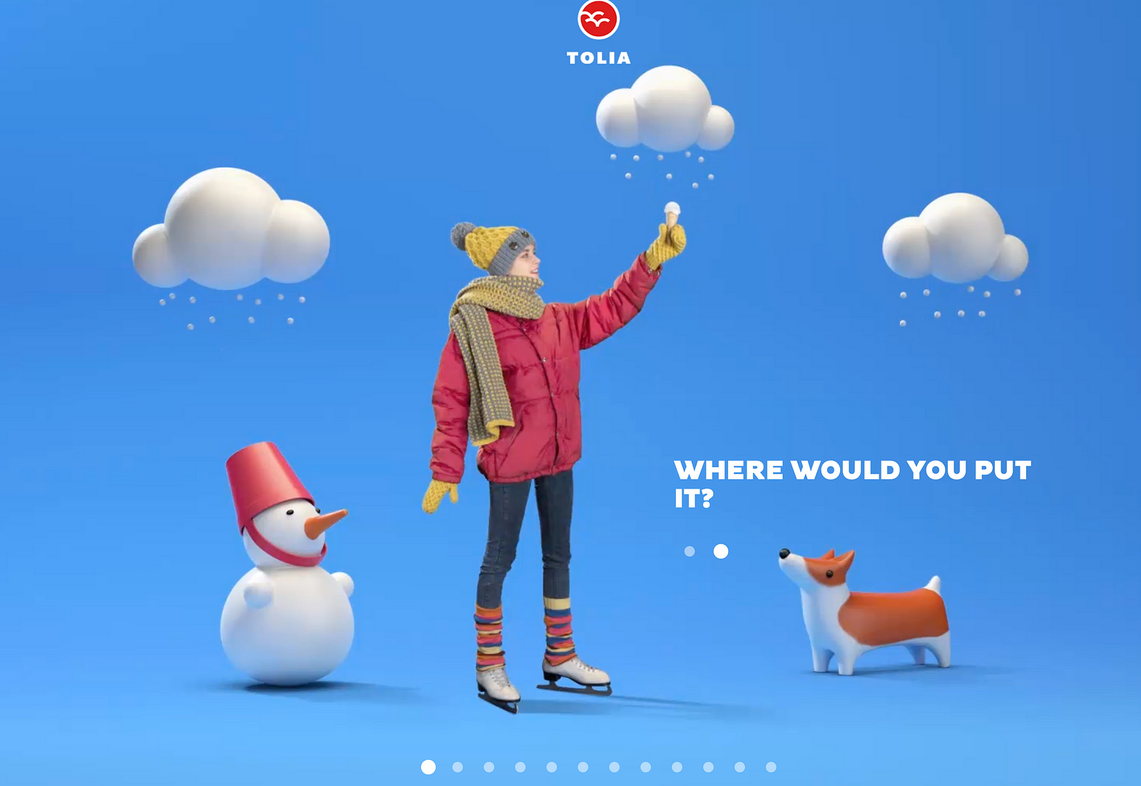
7. Tolia Ice Cream
Simple content, clean and big text. http://tolia.ge uses the placement of the text woven into the graphics. The font is heavy and has tight leading, but the graphics are simple and provide a solid background for the text. The heading is the same size as the content, however, it is timed so the header and content are not on the screen a the same time.