After some carefully timed hammering and muttered apologies to my condo neighbours I am happy to say I have finished my hierarchy word-drawer project.
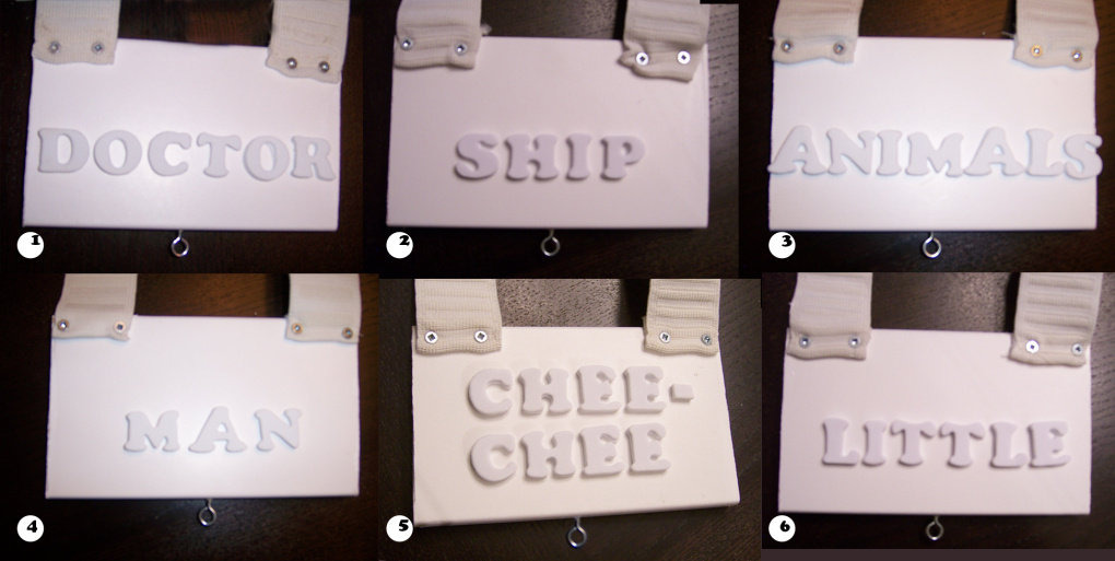
At the grand reveal on presentation day my classmates interacted with the piece in the way that I had hoped. Each “word-drawer” has a different level of tension applied to it. The lightest practically fell out on its own and the most intense tension required two hands plus a real desire to see the word. The least amount of tension equals the higher level of hierarchy because the participant would spend more time visually with the drawers that were easier to access.
From order of highest hierarchy to the lowest:
1.Doctor (super easy)
2.Ship (a little tension could be felt just before fully pulled out)
3.Animals (tension sets in at about the 3/4 mark)
4.Man (now you have to pull to see the full word)
5.Chee-Chee (it’s getting tough)
6.Little (if you really want to see this word, use two hands)
I painted the cover white, and used white word drawers and found some precut white foam letters (cooper black font). The idea was to remain neutral so the various tensions remain the focus. The use of 3D foam letters versus an ink or painted application meant there was no problem reading the tone on tone format. The only colour introduced was small green arrows pointing to each of the word-drawers.
The following photos show the word-drawers before they were assembled, and then the full assembled project.