Typography
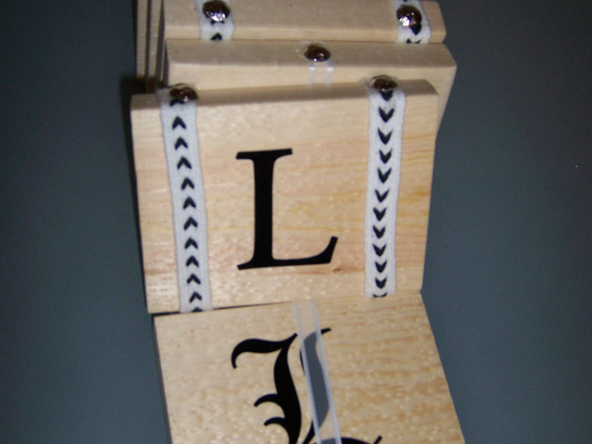
Jacob’s Ladder—Assembly
I procured some interesting materials from the interiors group where I work, unfortunately the cork samples where just a few pieces short and the veneer finishes on wood backing had holes in the top that I could not remove. Too bad about the veneer pieces especially, they were lightweight yet had a good density and […]
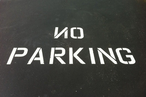
ON Parking
This could be read as ON PARKING depending on where you are standing. When I saw this freshly painted sign it took a minute to register that there was something wrong with it. This is a good example of how repetition of material, placement and message can create a symbol that is understood without reading […]
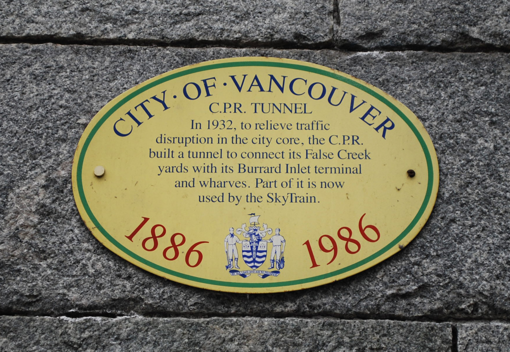
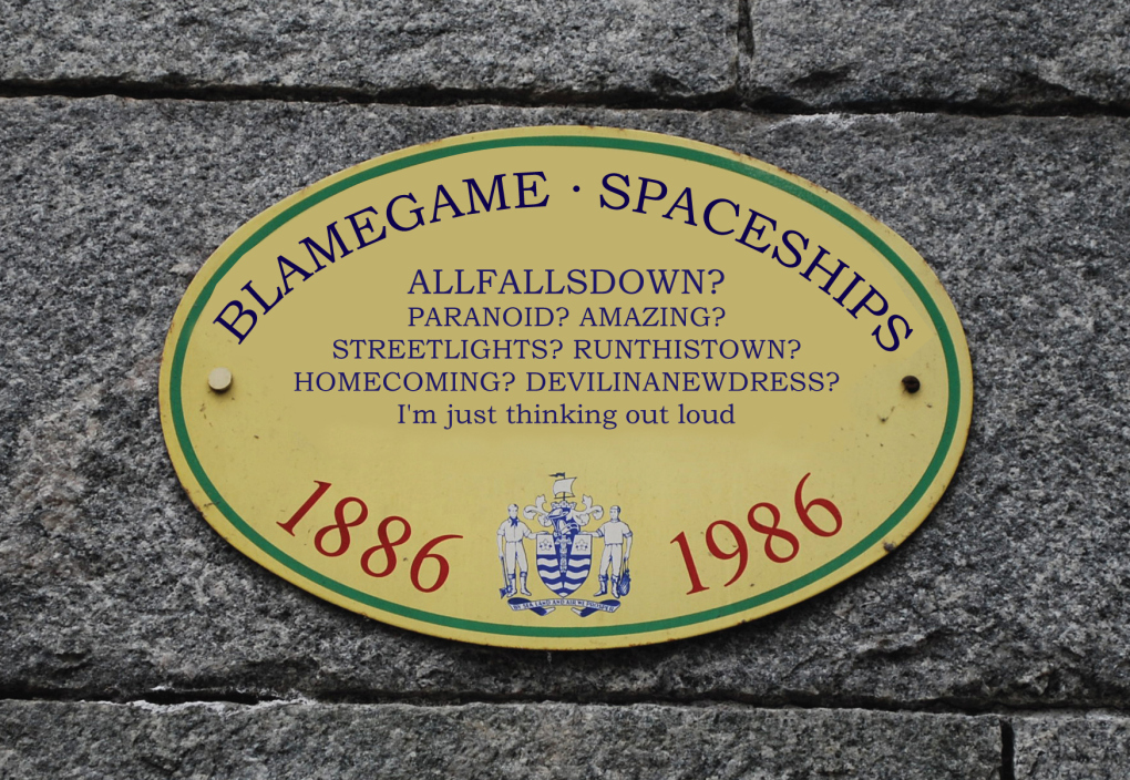
Are You Paying Attention?
This is a sign as you leave the Burrard SkyTrain Station. I wonder how many people would notice if I were somehow able to swap out the signs and carefully kept the look the same.
So Much Tension, the Final Chapter
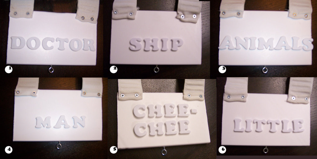
After some carefully timed hammering and muttered apologies to my condo neighbours I am happy to say I have finished my hierarchy word-drawer project. At the grand reveal on presentation day my classmates interacted with the piece in the way that I had hoped. Each “word-drawer” has a different level of tension applied to it. […]

